

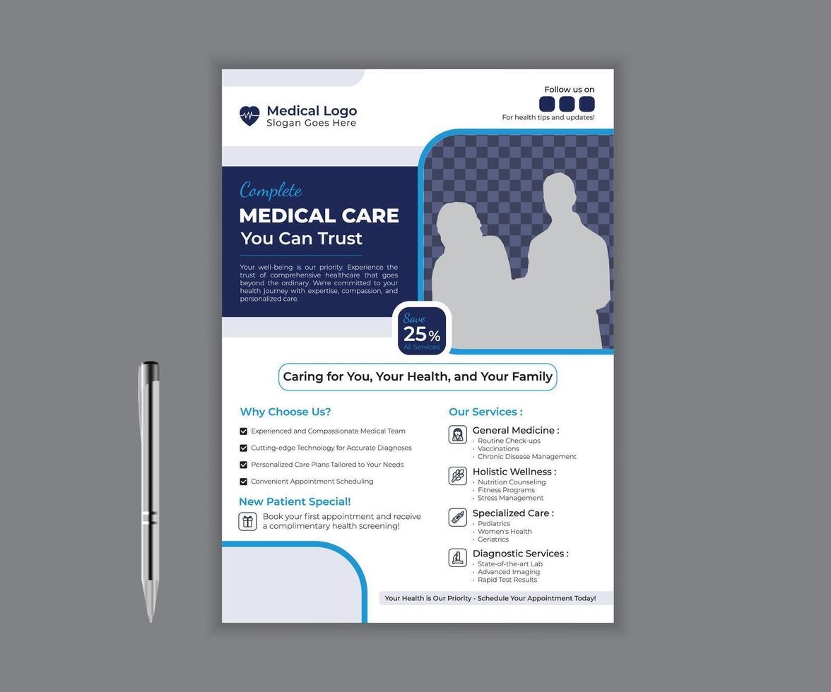
Walk into most medical offices and you’ll see the same thing: a printer-paper flu shot flyer taped to the glass, a curling insurance notice from three years ago, and a corkboard nobody has updated since the last renovation. None of it is wrong, exactly. It’s just forgettable, and forgettable is a problem when you’re trying to get a patient to book a follow-up or notice a new specialist.
Patients read your space before they read your chart. A clean, well-designed poster near the front desk or in an exam room signals that the same care you bring to their treatment plan extends to how you run the office. A sloppy one does the opposite, even if your clinical work is excellent. The posters inside your practice are part of the patient experience, and one of the easiest things in the building to actually control.
How Do You Design a Medical Poster Patients Will Actually Read?
Good in-office signage isn’t about looking fancy. It’s about being clear, calm, and easy to act on in the ten seconds someone glances at it while waiting for their name to be called. Here’s what actually moves the needle.
1. Choose a Calming, Trustworthy Color Palette
Soft blues and greens read as clinical and calm, exactly the tone you want in a space where people are often a little anxious. Reserve high-contrast colors like orange or red for things that genuinely need urgency, like a closure notice, so they don’t lose their punch from overuse. Stick to two or three colors per poster and keep them consistent with your exam room decor and website.
2. Design for Readability First, Style Second
A meaningful share of your patients are over 60, and vision changes with age. Health literacy guidance generally recommends a minimum of 12-point type for print, larger for anything read from a few feet away, like a waiting room sign. Use a clean sans-serif font, keep line spacing loose, and never rely on color alone to convey meaning, since some patients are colorblind.
3. Lead With Your Practice’s Branding and Credentials
Your logo, colors, and any board certifications should appear on every poster, not just your business cards. New patients scanning a “Now Accepting New Patients” sign want a quick trust signal: who are you, and are you legitimate. A consistent brand across every printed piece does that work quietly, without you having to say a word.
4. Use Real Photos, Not Stock That Looks Like Stock
Nothing undercuts trust faster than a poster featuring the same smiling stock doctor every other clinic uses. A photo of your actual front desk staff, your real waiting room, or your physician (with permission) does more for credibility than any headline could. If a proper photoshoot isn’t in the budget this quarter, AI image generation tools can produce a custom, on-brand background in minutes instead.
5. Say One Thing, and Say It Simply
A poster announcing extended hours, a new specialist, and a flu shot promotion all at once gets skimmed and ignored. Pick one message per poster. Lead with the headline, follow with one line of detail, and close with a single action (call, scan, or ask the front desk). Patients in a waiting room are distracted or a little uncomfortable. Simple wins every time.
6. Size and Format for Where It Actually Hangs
A waiting room poster gets viewed from six or eight feet away and needs bold, simple type. An exam room sign is read up close, so it can fit more detail, like a QR code to your patient portal. A front desk countertop card competes with clipboards, so it needs to work small. PosterMyWall’s health poster templates, built for these exact formats, save you from guessing at proportions.
7. Let AI Handle the First Draft of Your Copy
Writing a headline that’s warm but not corny, and clear but not clinical, is harder than it sounds when you’re also running a practice. PosterMyWall’s AI Writer can generate a few headline and body copy options for a specific announcement (a new hygienist, holiday hours, flu shots available) so you’re editing instead of starting from a blank page.
Frequently Asked Questions (FAQs)
1. How often should a medical practice update its in-office posters?
Review seasonal or promotional posters every few months, and swap them out as soon as the information is outdated. An expired sign reads as neglect, even in a spotless office. An editable template, rather than a piece you redesign from scratch, makes it painless to refresh dates and offers.
2. What size poster works best for a small waiting room?
An 11×17 or 18×24 poster usually fits without overwhelming a small space, especially if you’re hanging just one or two at a time. Larger practices with more wall space can go bigger for a single key announcement. Templates sized for standard print dimensions take the guesswork out of what will fit your frames.
3. Should exam room signage look different from waiting room signage?
Yes. Waiting room posters need to work from a distance and often promote something (a service, extended hours), while exam room signs are read up close and tend to be instructional (post-care steps, portal sign-up). Keep the same brand colors and fonts across both so the practice feels cohesive.
Bringing It Together
None of this requires a design degree or a big budget. It requires picking one message, making it easy to read at a glance, and keeping your branding consistent from the front door to the exam room. Do that consistently and your practice starts to feel like a place that pays attention to details, which patients notice more than you’d think. When you’re ready to put these tips into practice, the health poster templates are a solid place to start.
